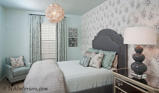
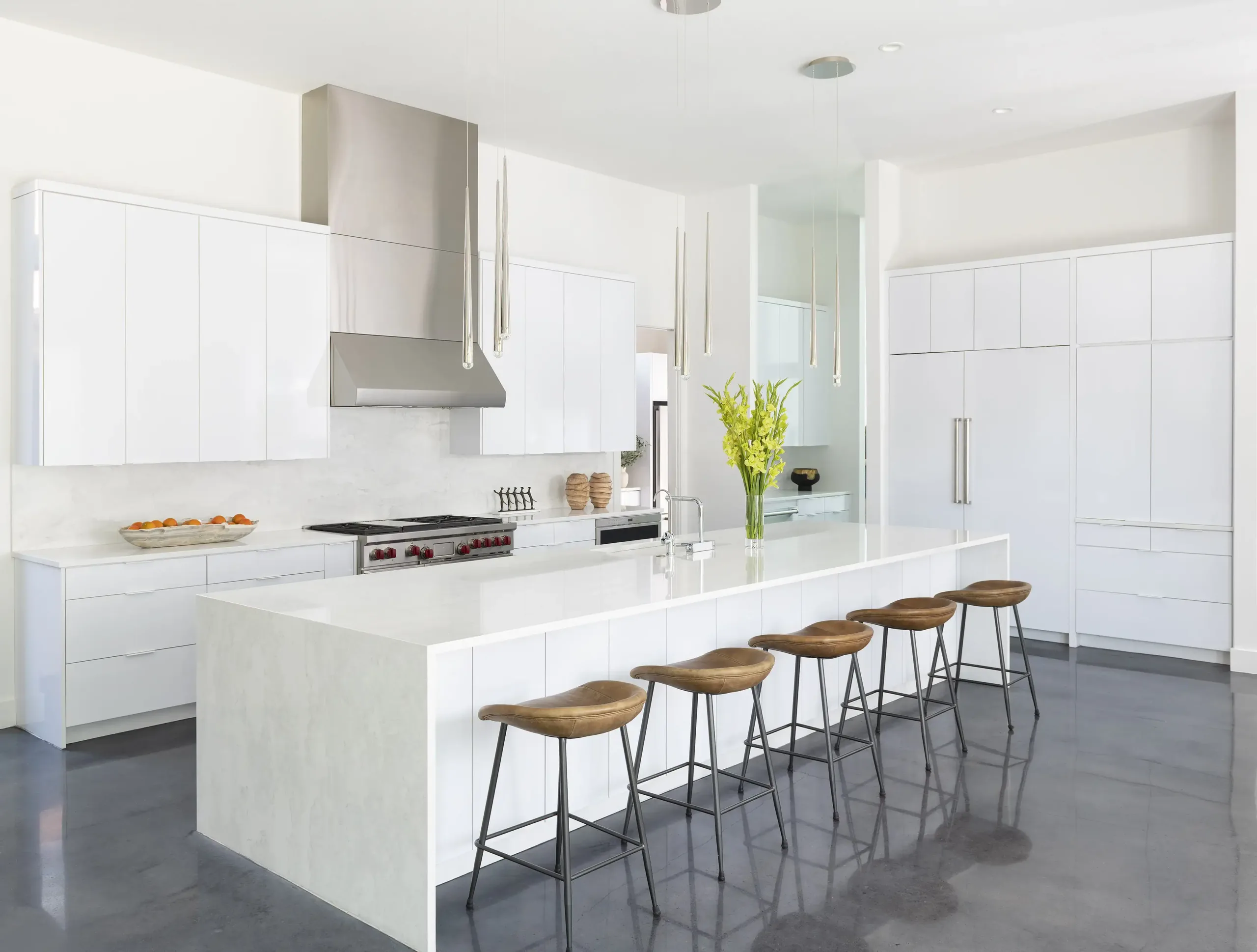
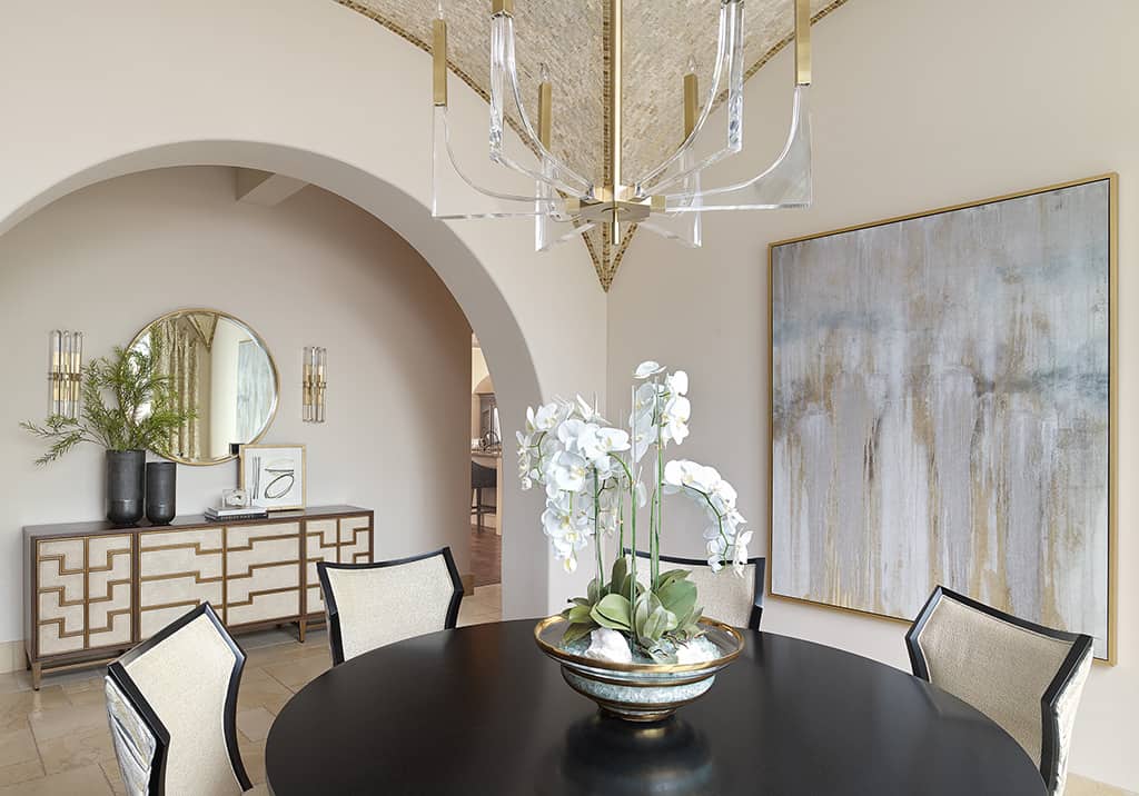
Deft use of patterns, textures and mirrored surfaces help add visual interest to this monochromatic room design.
Many people shy away from using a monochromatic color scheme for interior design, believing it’ll result in a bland or boring space. They wonder if the goal of a personalized space will fall short and doubt personality will show through. I hold an entirely different perspective! A monochromatic design can create an effect that is as stylish as it is elegant, and as powerful as it is personal.
The key is to maintain proven interior design techniques while embracing a well-balanced monochrome-based design.
Understand and Use Color
Color is vital in any design! Ponder these key terms and their roles to understand how to maximize the potential of a monochromatic color scheme.
- Hue: this is the core color itself: red, blue, green, etc.
- Chroma: a color’s purity or intensity
- Tint: a lighter hue: what results after mixing a color with white
- Shade: a darker hue: what results after mixing a color with black
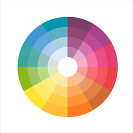
The color wheel is a key tool to view relationships between colors and choose the perfect color scheme.
These elements are easily seen in the color wheel—a vital tool for any visual artist. It lays out the colors in a circular transitional pattern and can be used as a guide to create the perfect palette for any room.
Just because one color dominates a space, doesn’t mean additional hues can’t be used to great advantage. If cool blue shades are predominant, a strategic use of orange tones, its color wheel opposite, can generate a wonderful warm “pop” within a room. Adding a green tint to the blue can quickly transform that same space into a Caribbean/tropical feel. Or, insert burlap or khaki colors and you have a crisp, New England coastal look. Professional interior designers are adept at manipulating color to achieve whatever mood and ambiance the client needs.
Adding Visual Variety
Controlling color range is not the only method to liven up a palette.
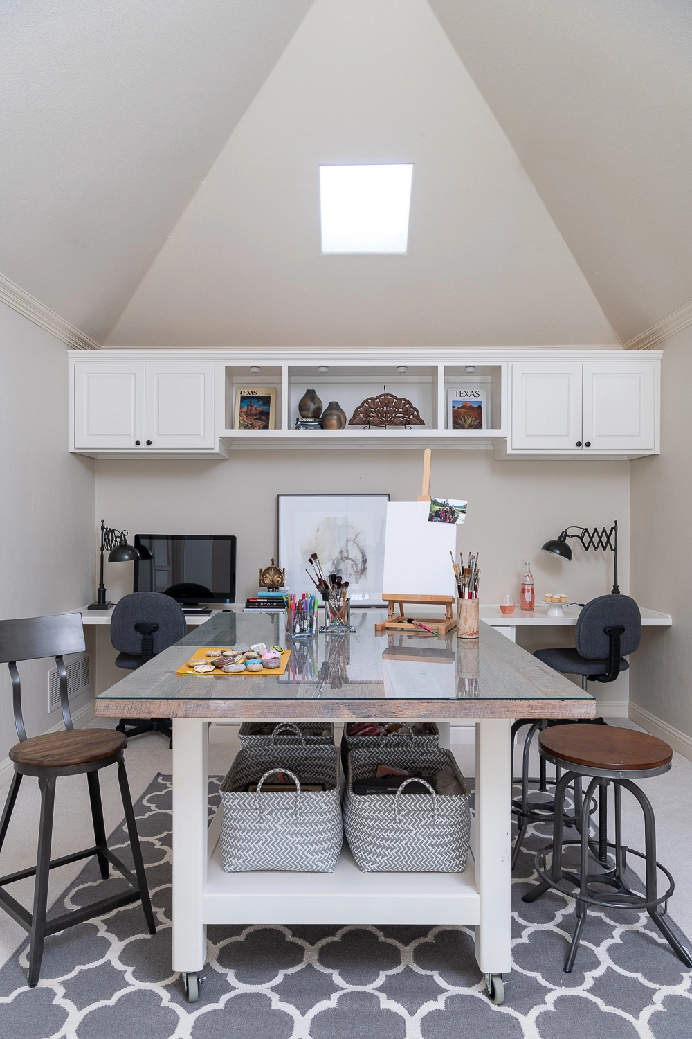
Fabrics, patterns and textures can be used to add a wonderful tactile element. I’ve used button trims on pillows, for example, or added organic elements like driftwood, wispy green plants or bamboo to enhance a space and bring it to life.
Likewise, you can employ metallic surfaces, mirrors, mercury glass, and basketry items to get the balanced look you desire. There is, in fact, an endless supply of items and accent pieces that, when placed just right, will set off a room beautifully within a monochromatic color scheme.
Why Choose a Monochromatic Color Scheme?
Clients choose monochromatic designs for many reasons. Some choose it for the practicality and flexibility it allows. A tight focus on a color opens the door to adding varying hue on pillows, rugs and artwork. It allows simple seasonal changes, such as a prominent beige couch becoming a bright and festive focal point during the holidays with the addition of a few bright colored pillows.
The simplicity of a monochrome color scheme can create soothing emotional benefits. Using a single color, particularly that favorite subdued color of yours, can help promote calm after a hectic day. Some clients have even used a relaxing color scheme when designing playrooms for overactive children.
Remember, monochrome doesn’t have to be dull. Done properly, it can be quite the opposite—a fun, lively atmosphere that engages multiple senses. With so many design options available, this is one more way to produce a space that truly expresses the uniqueness of who you are in a classic and sophisticated way, sure to be noticed!






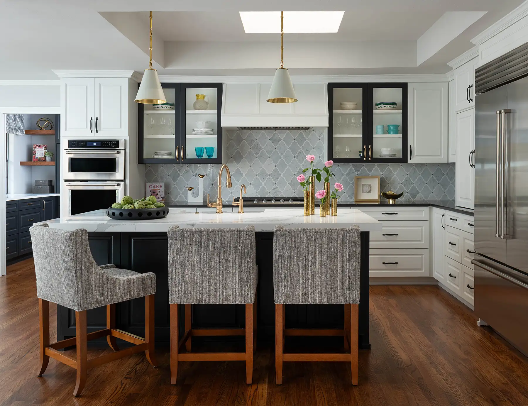

Monochromatic schemes bring a cohesive and calming aesthetic. Appreciated the insights on using layered tones to create depth and a sophisticated ambiance—truly inspiring for interior design!