Which gray is right for me?
Does Color puzzle you? When is too much or when is there not enough? We’ll take a dive into varying degrees of color use to show you the many beautiful results that can be achieved by properly regulating tones, hues and mixing palettes. I’m convinced, this spring is the season to add some color!
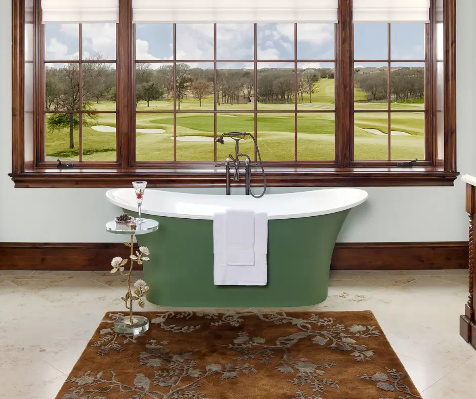
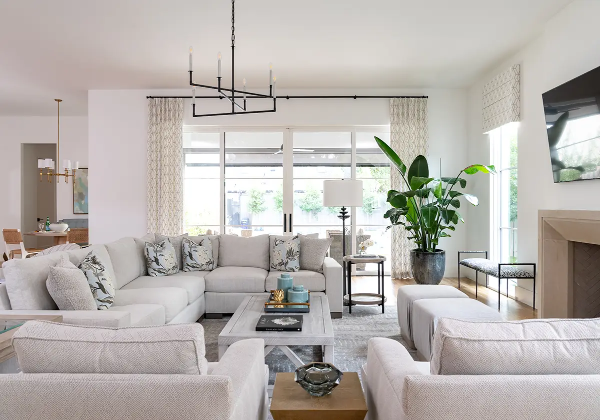
Neutrals are always safe, predominantly when used on a broad area in a home or office. One of the consistent, popular neutrals is Gray It emerged as a trend a few years ago and hasn’t lost its momentum yet! Many different hues of this color are used to create varying warm and cool color environments. Use a dark charcoal for a dramatic pop or an accent wall. Use a foggy gray to achieve a light and airy, relaxing feel.
Here, I’ll share some of our most loved selections… but remember, if you need help with your color selection, you can always call me at (214) 326-1160 and I would be glad to talk to you.
Cool Grays
Zircon
SW 7667
This silver gray paint color actually looks more silver and will appear luminous in a well-lit space. This looks great when paired with white.
Stone Harbor
2111-50
This is a very saturated, pewter gray and communicates a cool look. This shade pairs beautifully with a bronze.
Mt. Rainier Gray
2129-60
This example of a “steel gray” has a blue undertone. It’s a cool shade and appropriately referenced due to its steel-like appearance. Whites and creams pop off of this color well as accents!
Exclusive Plum
SW 6263
This is a very dark gray with purplish undertones. You want to use this shade in more of a casual space because it has more of a less formal feel.
Gibraltar
SW 6257
Deep charcoal grays, also known as smoky grays, are very calming and are a great choice for a bedroom or accent wall. A high contrast, contemporary look can be achieved when paired with white or vivid colors.


Warm Grays
North Star
SW 6246
This medium gray shade creates a happy, cheery space. Try pairing the color with yellow to ensure it’s overall look of warmth.
Mega Greige
SW 7031
When combining the gray with the earthy qualities of beige, the result is “greige”! Some call it warm gray or cool beige. Regardless, it’s an organic stonework color with elegant neutral tones. This color looks great particularly in offices or common areas in homes, and is a good in-between color when the contents of the rooms are uncertain.
Steely Gray
SW 7664
This slate gray looks fantastic paired with tans and light wood tones. It’s another great medium gray to use throughout the home.
Cascade White
2127-70
This is a subtle tint that is a nice alternative to white.
Gray Horse
2140-50
This shade looks beautiful used in a large open space. It is a warm and inviting hue and would look great used in Kitchens and living rooms.


Other Great Grays to Consider
Light/Cool Gray – Benjamin Moore Affinity Palette

Benjamin Moore – Kendall Charcoal HC-166
")
James Hardie’s – Iron Gray JH90-30 (exterior)

Sherwin Williams – Gray Area 7052

Sherwin Williams – Wool Skein 6148

Sherwin Williams – Analytical Gray 7051

Let’s Make Your Dream Project a Reality!
Schedule a consult for your next home or commercial interior design project today!
Subscribe to Our Newsletter
Get interior design inspiration and tips delivered straight to your inbox.
"*" indicates required fields
Free Downloads