Nicole’s Neutrals | Spring 2023 Edition
Spring is a great season for pastel tones grounded with neutral whites, creams, and sandy colors. This season we’ve selected fabrics and tones that bring us right back to our favorite beaches. Our picks include linens, embroidery that embraces the natural world, and airy prints! We can’t wait to show you how we’d style these tones around your interiors. Let’s dive in!

Springtime Flavors
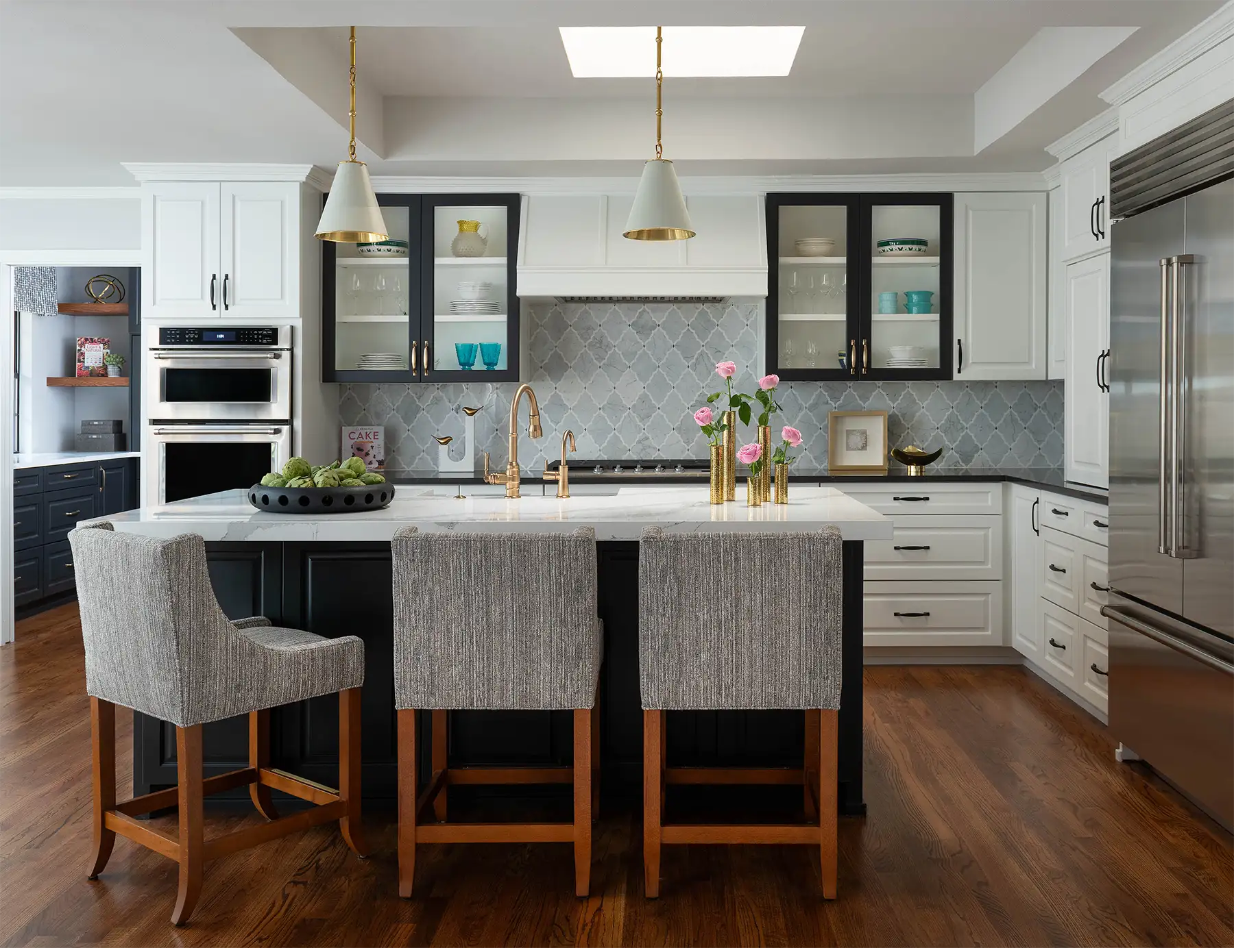
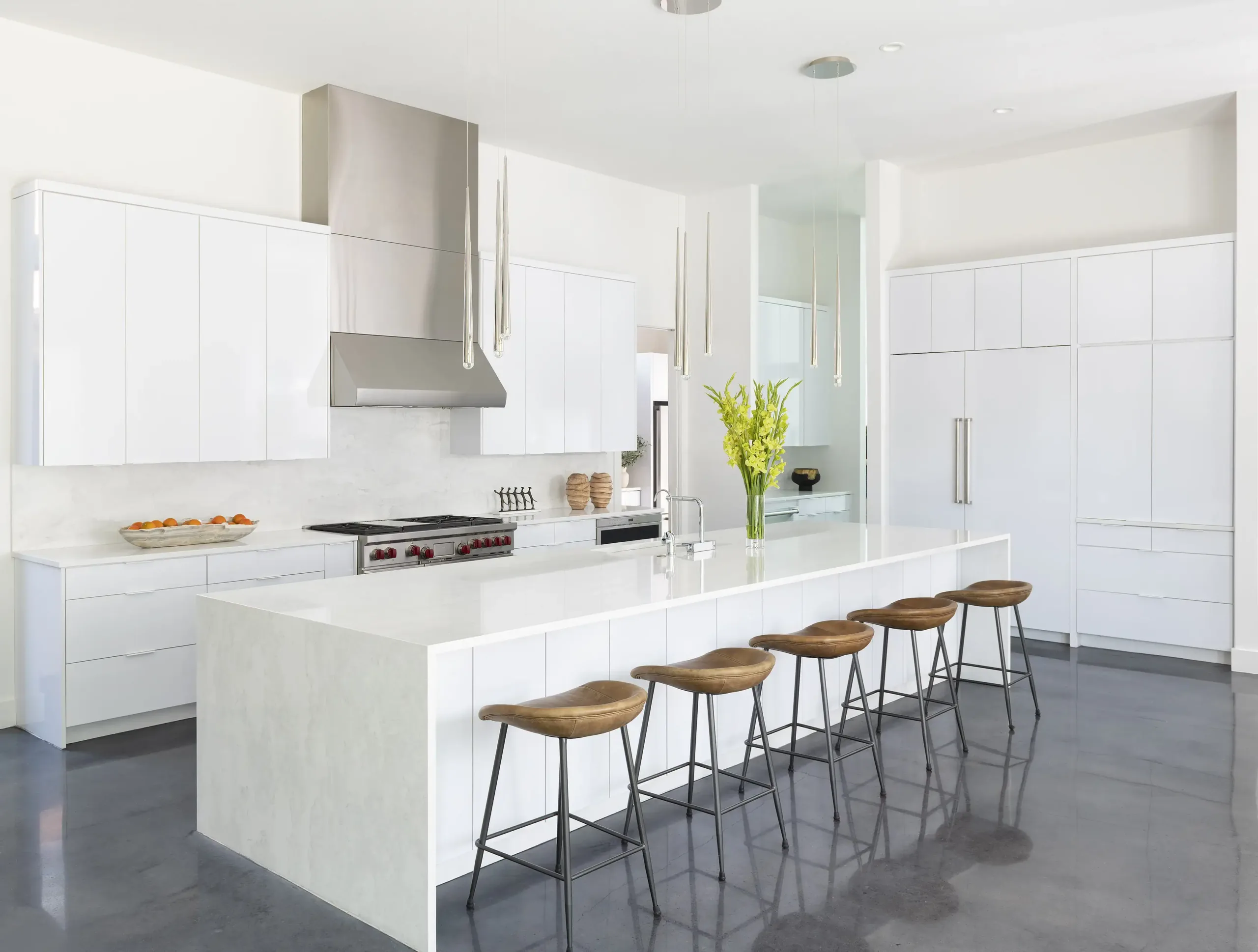
You can find our top neutral colors at Sherwin Williams. Reminiscent of neapolitan ice cream, these colors can be added into decorative pieces, furnishings, and wall paint! You can use these pastels as your main color palette or use them sparingly to add subtle pops of color throughout the room. Look for artistic pieces that have one or a combination of these tones. Whether you’re decorating a bedroom, bathroom, sunroom, or dining room, these colors can be a great choice for creating a relaxing and welcoming ambiance.

Layered Linens
As the weather outside gets warmer, we are looking to linens to provide a lightweight look and feel. Linen’s natural properties provide breathability and a cooling effect, and can be used as drapery, accent bedding, or on decorative pillows. Embroidered linens add a vintage charm to a room and can look cohesive with your room’s theme. For curtains, choose one of our spring colors that complements your existing decor and consider a floral or nature-inspired print. Sheer linens provide a nice airy look, or line them for solid curtains that block out light and sound throughout the evening.

Fawn Over Florals

Light-toned prints, like this floral wallpaper, add energy to a wall, but are still visually calming enough to include in an interior. We find they can be particularly effective in a bedroom or bathroom design. Pair it with solid or neutral-colored furniture to create an elegant look or use bold accent pieces to create a more striking contrast. To make your print the focal point of the room, look for large-scale prints that flow with the rest of your decor, but have some whimsy. Finding the right balance with your prints keeps the space feeling elegant and sophisticated.
When it comes to patterned furniture, using light-toned floral prints can be a bit trickier. You don’t want the floral print to overwhelm the room or clash with other patterns. Accent chairs, ottomans, or headboards can be a great way to bring some color and pattern into the space without overpowering it. We envision this being lovely in a study room, nursery, or master bedroom!
Outdoor Inspired Prints & Textures
Whether you’re decorating a bedroom, living room, or dining room, outdoor-inspired prints can be a great choice for adding a touch of nature-inspired charm to your space. Gardenesque accent fabrics bring life to a room by way of pillows, drapery, and bedding. Neutral colors like sand, camel, and burlap in a natural sisal rug provide an organic and grounding feel. Velvet pinstripes with a fine cut and weave add some saturated tones to the mix without being heavy, and would look great on upholstery! Mix and match these prints around a room to add dimension and eclecticness. Add a new house plant, fresh flowers, or branches to a room for dimension. Using woven baskets and wooden accents can also add a touch of rustic charm to your space.

Spruce Up Your Space!
Our springtime neutral tones can add a calming and soothing atmosphere to any interior. By using them in moderation and pairing them with neutral colors, you can create a sophisticated and elegant space. Want additional design guidance to spruce up your home or office for spring?! Contact Nicole Arnold Interiors today!

Let’s Make Your Dream Project a Reality!
Schedule a consult for your next home or commercial interior design project today!
Subscribe to Our Newsletter
Get interior design inspiration and tips delivered straight to your inbox.
"*" indicates required fields
Free Downloads