I think many would agree that mixing patterns can be a challenge. And while an interior design that mixes and matches prints and patterns to stylish perfection is coveted, it’s often difficult to create a look that’s a smash — not a clash.
But don’t fret! By understanding a few simple rules of pattern mixing, your space will be fabulously in vogue. The key is to mix patterns carefully and tastefully so each pattern remains special and gets its due attention in the overall room design. Let’s take a look at how to “make it work.”
1. Pay Attention to Scale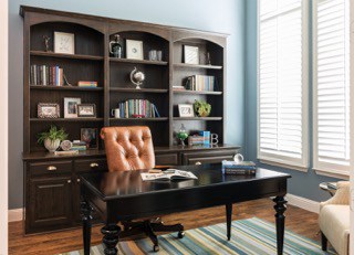
Consider it the interior design equivalent of signing a non-compete clause: It’s vital to vary the scale of your patterns so they don’t compete with each other. For example, consider grouping a large floral print with a medium geometric pattern and a small pinstriped print. Consider the 60/30/10 Rule: 60 percent for your main pattern, 30 percent for the second and 10 percent for the accent. Then, add solid colors to avoid a busy or overdone look.
For most applications, it’s also important to match scale with scale. Use large-scale patterns in large spaces and small patterns for smaller spaces. So, if you have a large pattern, try it on a large piece, like a sofa or duvet cover. Bold prints are perfect for smaller pieces, like frames and throws, which can be changed out frequently if you tire of the print.
If you would like your space to appear taller or larger, consider using vertical and horizontal stripes, which has the most impact on wallpaper, area rugs and draperies.
2. Fund Your Foundation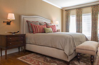
What’s the common link in your design? It’s that thing that holds everything together in order for pattern mixing to make a notable statement. Your foundation (or some refer to it as their jumping off point) could be a color palette or décor theme; then, use patterns to relay this consistent style throughout your home.
Whether transitional, modern, bohemian, tribal… your print mixing will help define and punctuate your favorite interior design theme with style. Then, use colors to support or contrast the patterns in a complimentary way.
3. Don’t Forget About Texture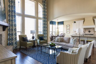
If pattern is the leading lady of your interior design, then texture is definitely the crucial supporting actress. In fact, textures like fur, leather and velvet are various sumptuous fabrics can be interpreted as pattern when an actual patterns isn’t desired, such as in monochromatic spaces.
Texture also adds depth, and can make a room visually interesting and very luxurious, when properly layered and utilized throughout a space. And while texture can add an important, posh layer to your print mixing, be careful your textured patterns on your favorite home décor, such as rugs, artwork and small accessories, don’t compete with the rest of your space. The design may become diluted, and your space will appear cluttered.
The most important rule? Remember to have fun…choose colors and patterns you absolutely love. Patterns give personality to a space, so don’t be afraid to use them. Simply consider these tips, and you’ll be a print-mixing pro in no time!
If you’d like some professional help, Nicole Arnold Interiors is here for you. We’re masters at matching patterns. Just call 214-326-1160 to set up a consultation.
Let’s Make Your Dream Project a Reality!
Schedule a consult for your next home or commercial interior design project today!
Subscribe to Our Newsletter
Get interior design inspiration and tips delivered straight to your inbox.
"*" indicates required fields
Free Downloads


Nice post. Thanks for all the detailed information for mixing patterns. Its such a great idea. Thanks for the great ideas. Will surely gonna try it. Thanks for sharing!
Hi Nicole. Great tips on mixing and layering patterns. We’ve featured your blog on Studio Designer’s Facebook and Twitter, as we so frequently do your blogs, as you are such a great writer.